Combine Colors in Your Home: 6 Simple Tricks for a Cohesive Look
By: Enigma Content Team | Last updated: October 7, 2025
Choosing colors for your home can feel hard. There are so many choices! And most people don’t know where to start.
Here’s the good news: You don’t need to be an interior designer to make your home look great. You just need a few easy tricks to combine colors in your home and look cohesive.
Let’s go over how to do it step by step.
Why Color Can Feel Overwhelming
Most of us want our homes to feel calm, cozy, or fun. But when we try to decorate, the colors don’t work.
That’s because traditional color theory doesn’t really help in real homes. It talks about pure colors—like bright red or blue—but most home colors are softer, more mixed, or neutral.
Also, the same color can look different depending on the light or what it’s next to. That’s why things can clash or feel “off.”
So instead of guessing, let’s learn the tricks real designers use.

1. Start With the Feeling You Want
Before you pick a color, ask this: How do I want this room to feel?
- Calm and peaceful? Try soft, muted colors like light gray, beige, or dusty blue.
- Cheerful and bold? Use brighter colors like coral, teal, or sunny yellow.
- Warm and cozy? Go for earthy tones like terracotta, warm taupe, or olive green.
Color is emotional. One shade may feel joyful to one person and too bright to another. That’s okay. Pick what feels right to you.
Also, think about how you use the room. A bedroom should feel restful. A kitchen might feel better with energy and light.
2. Work With What You Have
If you already have things in the room—like flooring, countertops, or large furniture—you need to use them as a base.
These things often have colors you can’t change. So instead of fighting them, build your palette around them.
Look closely at those finishes. What are the main colors? Are they warm or cool? What smaller colors do you see in the pattern?
You can even take a photo and upload it to a color picker site like Coolors to pull a matching color palette.
3. Match Color “Temperatures”
Every color is either warm or cool. For example:
- Warm colors: red, orange, gold, cream
- Cool colors: blue, green, gray, pure white
Try not to mix warm and cool colors randomly. It can make your space feel unbalanced.
Instead, choose one group to be dominant. Then sprinkle in a little from the other for balance.
For example, if your room has cool gray walls and navy accents, add a bit of warmth with a beige throw or wood table.

4. Use the 60-30-10 Rule
This is a simple trick designers love. Here’s how it works:
- 60% of the room should be your main color
- 30% should be a supporting color
- 10% is your accent color
Let’s say you love sage green, warm wood, and ivory.
You could paint the walls sage green (60%), have wooden furniture (30%), and add ivory pillows, curtains, and candles (10%).
This creates balance and avoids a messy look. Repeat each color a few times across the room in different ways.
5. Stick With Either Muted or Bright Colors
There are two types of color styles:
- Muted/earthy colors: soft, dusty, and natural
- Bright/clear colors: crisp, vivid, and bold
They don’t usually mix well. If you try to use both, the room can feel disjointed.
For example, a bright blue pillow might clash with a soft brown rug. But if both colors are muted or both are clear, they’ll work better together.
Tip: If you really love one bold piece, use it in small doses—and repeat it in one or two more places to tie it in.
6. Test Colors in Real Light
Paint swatches and fabric samples look different in the store than at home.
That’s because light changes how colors appear. Natural sunlight can make a color look cool. Warm bulbs can make it look yellow.
So before buying anything, test the samples in your space. Look at them in the morning, afternoon, and evening.
Also, place them near other items in the room to see how they work together.

Common Mistakes to Avoid
Here are some things to watch out for:
- Using too many colors: Stick to 3 or 4 colors per room.
- Ignoring undertones: Two “beige” colors might clash if one is warm and one is cool.
- Skipping samples: Always test paint and fabrics before you commit.
- Matching everything exactly: You want harmony, not a showroom. Slight differences add character.
Wrap-Up: How to Combine Colors in Your Home
Combining colors isn’t about picking the “right” ones. It’s about creating a space that feels good to you.
Start with a feeling. Use what you already have. Repeat colors in smart ways. And always test in real light.
Over time, your home will come together in a way that feels natural and welcoming.
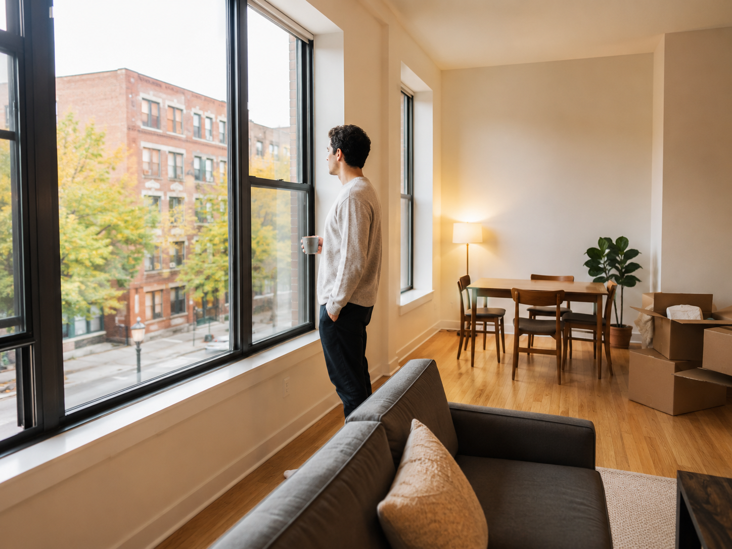
Looking for a New Apartment in Milwaukee?
If you’re ready to find a space you love, Enigma Properties can help. We have well-kept apartments all over Milwaukee—each one with its own charm. Whether you’re moving into your first place or upgrading, check out our current listings to see what fits your style.
FAQs
Q: What is the 60-30-10 rule in interior design?
It’s a guide where 60% of your space is the main color, 30% is a secondary color, and 10% is an accent.
Q: Can I mix warm and cool tones in one room?
Yes, but one should be dominant. Use the other sparingly and repeat it to balance the space.
Q: How many colors should I use in a room?
Three is a great starting point. More than four can make the room feel busy.
Q: What colors make a home feel cozy?
Warm tones like terracotta, tan, and deep greens make spaces feel calm and cozy.
Q: Why do my colors look different at home?
Light affects how colors appear. Always test paint and fabric at home before buying.

Sources
- Better Homes & Gardens. Color Rules Designers Swear By. Published March 2024.
- The Spruce. How to Choose a Cohesive Color Scheme for Your Home. Published July 2023.
- Architectural Digest. The 60-30-10 Rule Explained. Published February 2023.
- Coolors. Color Palette Generator. Accessed October 2025.